I wasn’t planning on actually reviewing the hotel until I checked out, so I’m apologise for some missing photos.
My Bloomsbury London is part of My Hotels, which is a small standalone chain with three locations around the London area. Bloomsbury is around a 20-minute walk from Oxford Street, within close proximity to Tottenham Court station. The surrounding area is home to Russel Square, the British Museum and the University of London, where I was attending a summer course.
We arrived at the hotel after driving from my aunt’s house on the outskirts of London. My first impression of the lobby was that it was small but intimate. The design was warm and homey. I liked the sit-down check-in desk, which contributed to the boutique feeling. We were welcomed by a friendly associate. Despite our early arrival, she was able to assign us a room.
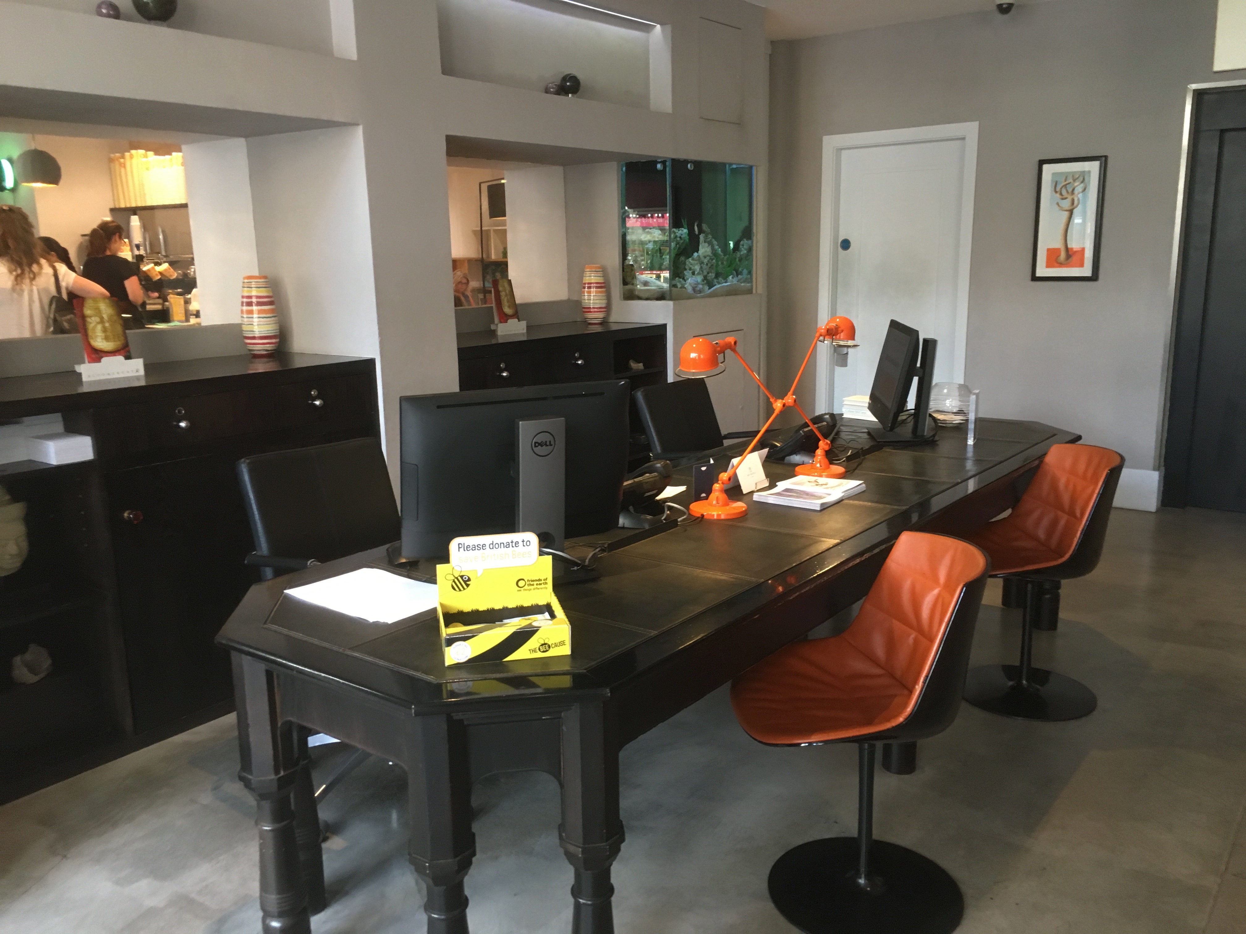 My Bloomsbury London Lobby
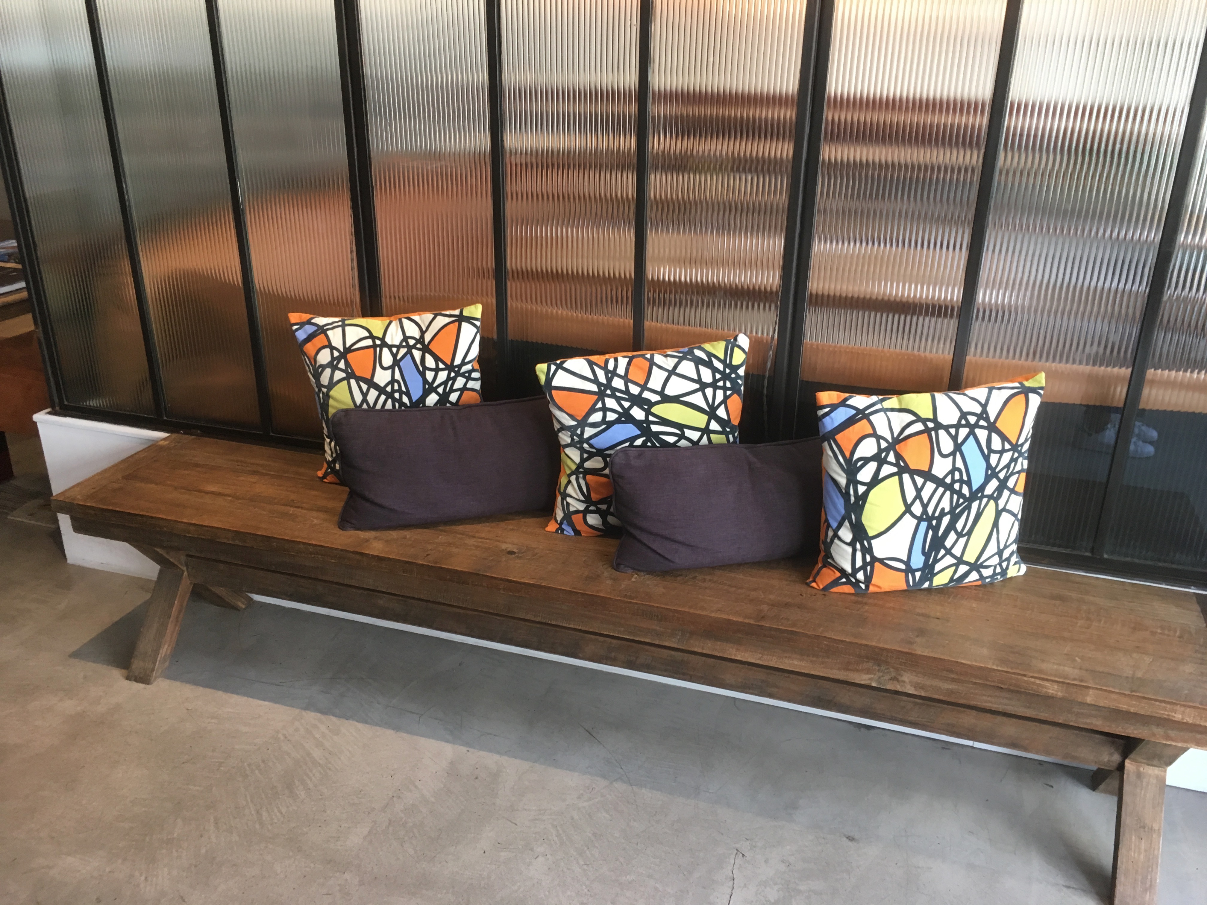 My Bloomsbury London Lobby
The hotel is home to a restaurant and a small bakery, which I didn’t get the chance to try out during my space, as well as a co-working space.
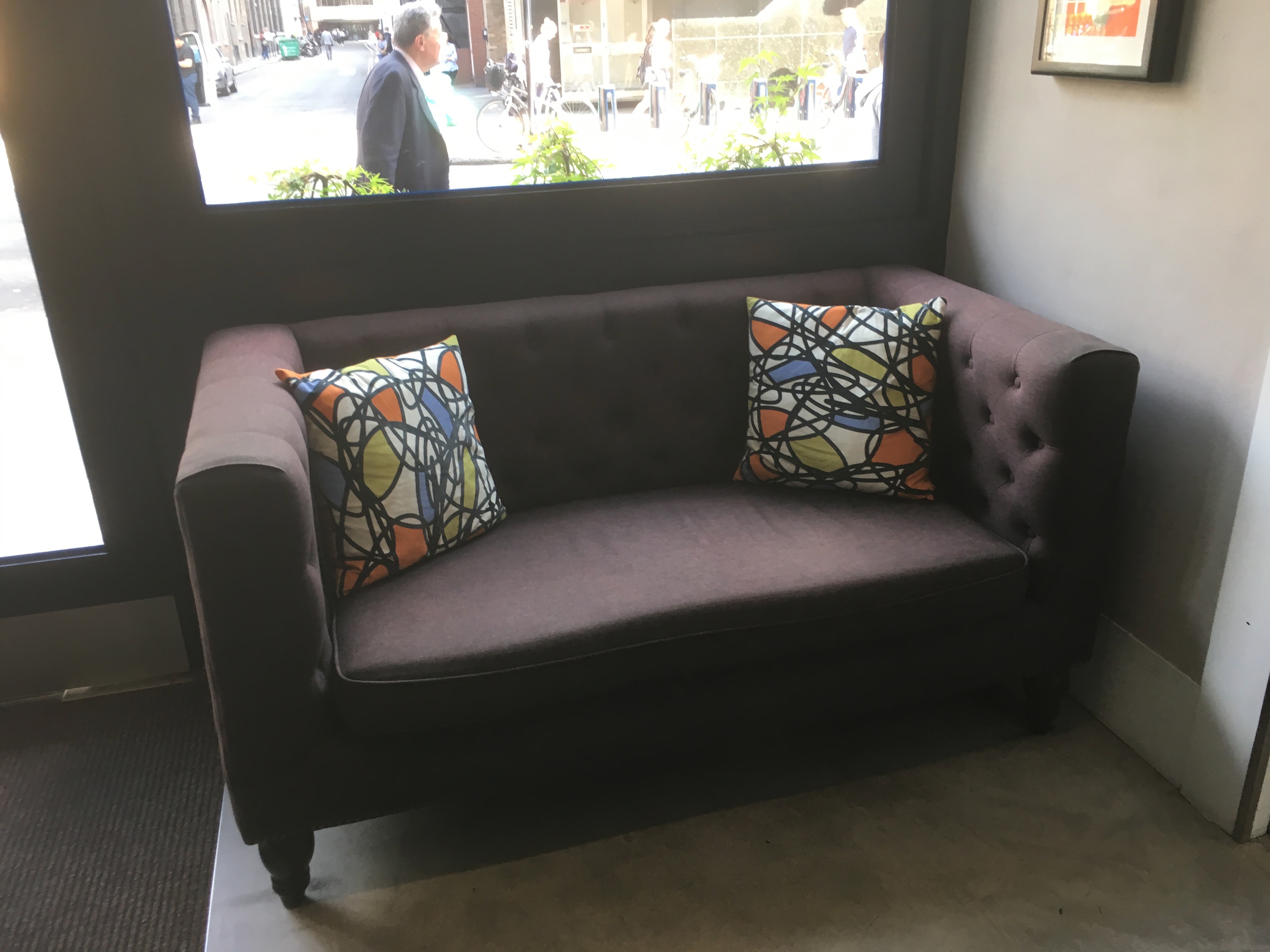 My Bloomsbury London Lobby
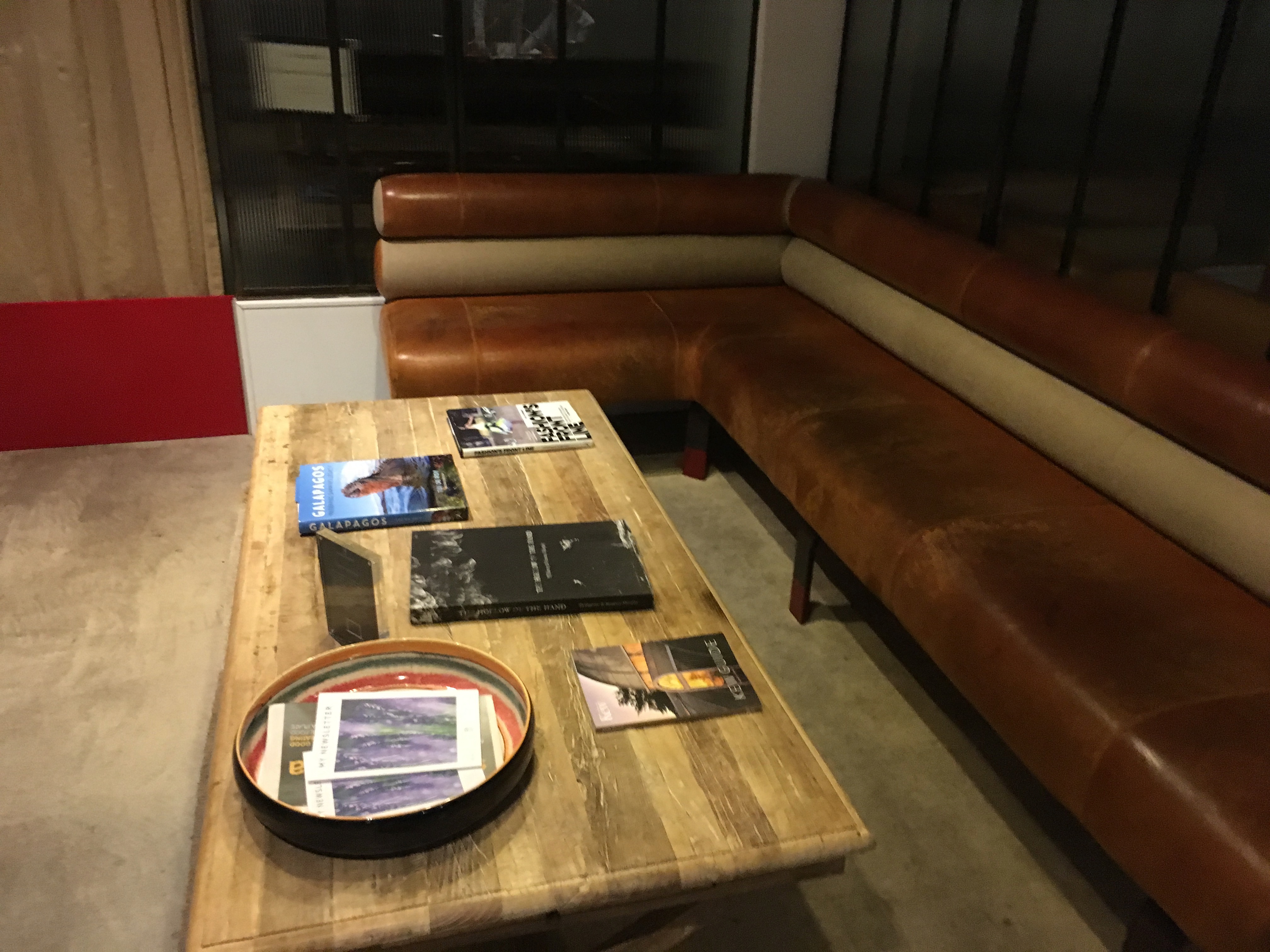 My Bloomsbury London Lobby
There was a little fish tank near the lobby that I thought was another nice deviation from your average big cookie-cutter hotel.
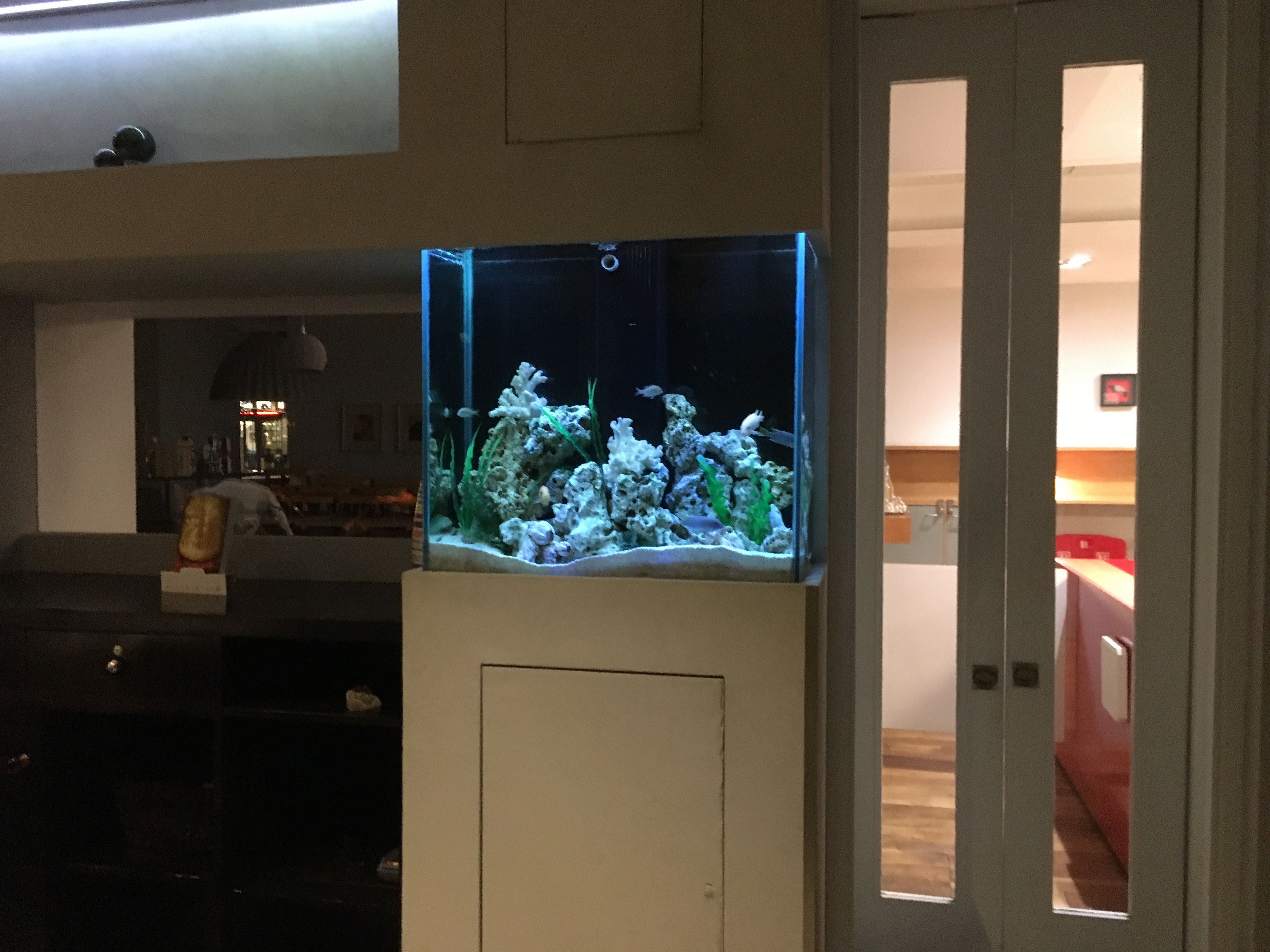 My Bloomsbury London Lobby
The elevator was keycard operated. While I appreciate the security aspect of the keycard reader, the card reader was spotty and it ended up becoming more of a nuisance for guests.
My Bloomsbury London
Check-in: July 10, 2017
Room Type: Standard Double Room
Stay duration: 5 nights
Check-out: July 15, 2017
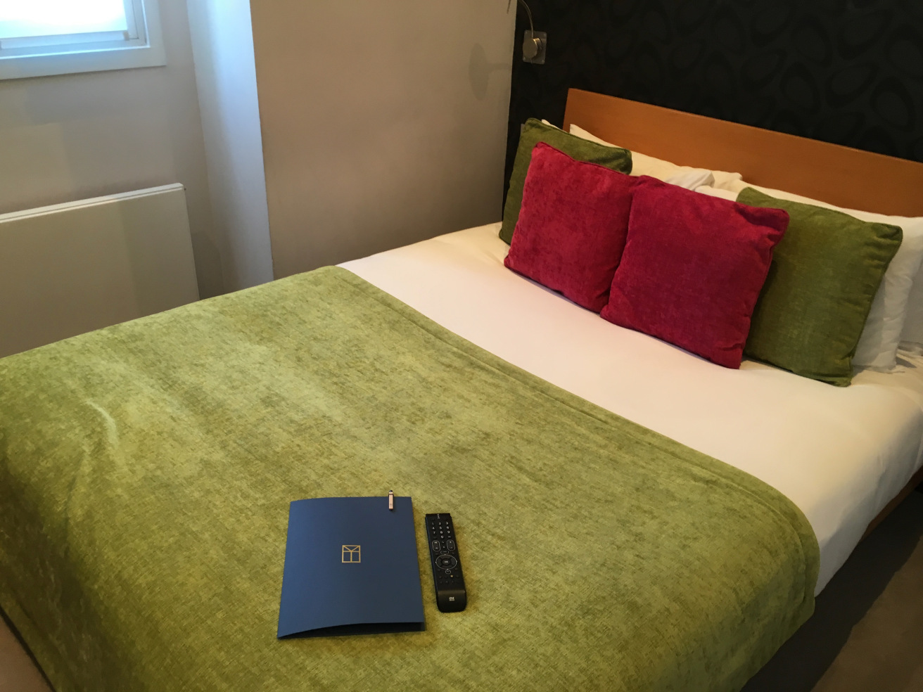
We were assigned a Standard Double Room on the first floor. My first impression was that the room was tiny. While I wasn’t expecting a suite, this is what the hotel is advertising on their website:
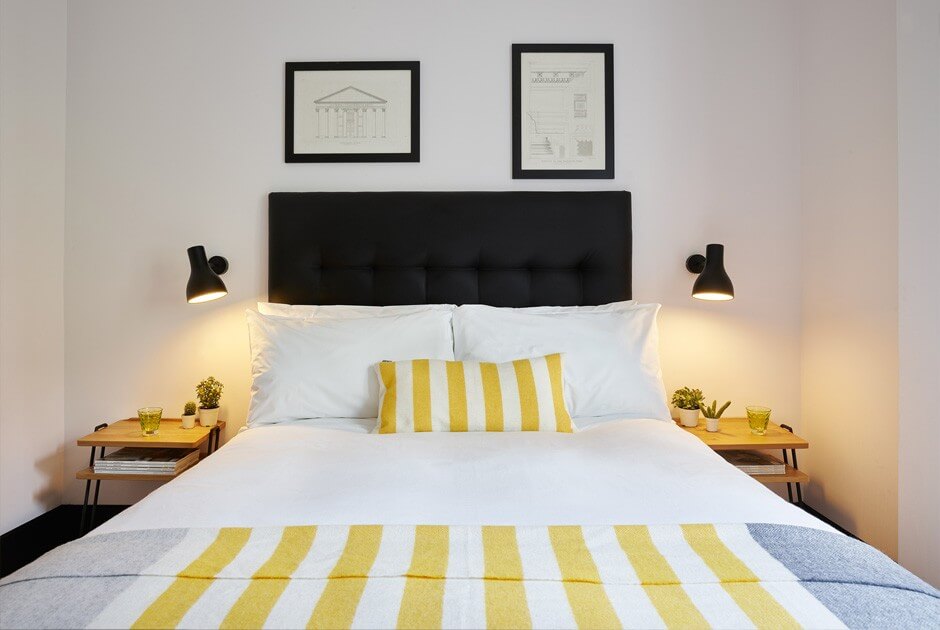
My Bloomsbury Hotel Standard Double Room Marketing Shot
This is what my room actually looked like:
 My Bloomsbury Hotel Standard Double Room
Doesn’t that look like an Expectation vs. Reality Instagram post? Now, that looks a lot smaller than what the picture made it look like. There was so little space in the room it literally felt like a shoebox.
While the color combinations weren’t disgusting, I was expecting a clean, modern and small but comfortable room. Instead, I got a cozy room that looked like it had been designed in the early 2000’s.
There was a desk/counter setup. On the desk was a diffuser, which I liked. Underneath the desk was the minibar. The saving grace of the room was the plethora of power ports located under the desk – too many hotels get this tiny practicality wrong. There was also a tiny open closet and a shelf with snacks and some basic amenities like a kettle (not pictured).
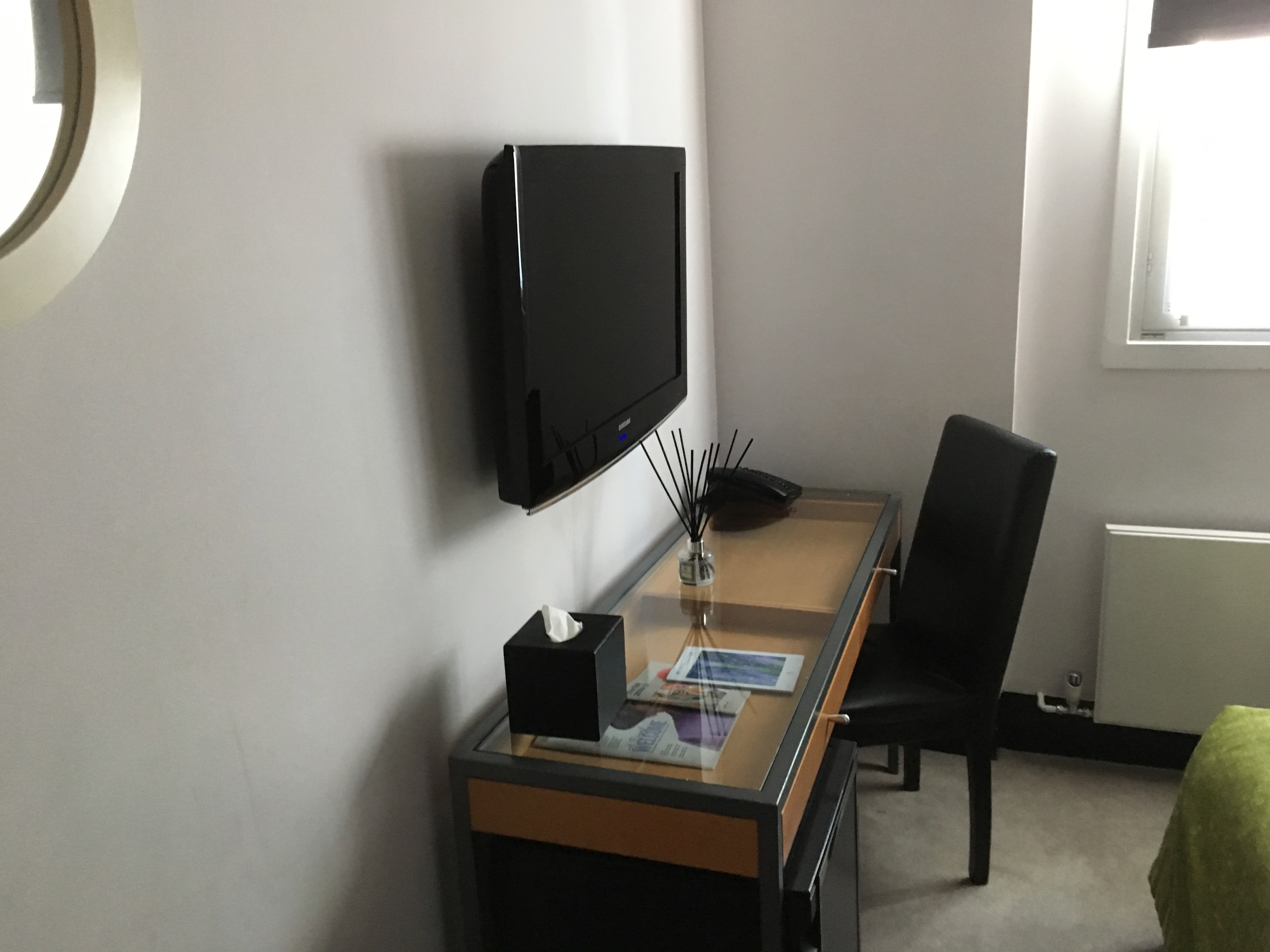 My Bloomsbury Hotel Standard Double Room
I didn’t take a photo of the bathroom, but it was also comically small. There were a sink and a toilet, which were so close to each other that you could literally wash your hands while sitting on the toilet.
There was also a shower/bathtub combination. The sink didn’t have any counter space, but there was a tiny ledge which could store a couple of toiletries. Amenities were the British brand Anyah Hotel Toiletries and were actually quite decent.
Bottom Line: My Hotel Bloomsbury
While I liked the boutique and cozy feel of the hotel overall, I didn’t like how that extended to the room size. Although London is a hotel market notorious for small rooms, this room looked like it had been designed for Snow White’s dwarves. The best part about the experience was the excellent location of the hotel. Aside from that though, I was pretty disappointed. I’d try out other options in the area if I were to return.


