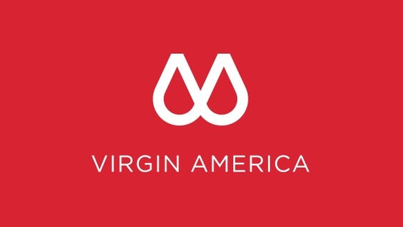
Virgin America has come up with one of the most inspirational logos as part of their new branding.
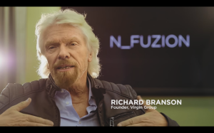
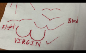
The new logo is part of Virgin America’s new rebranding #DeepVX, an evolution of what was apparently drawn on a napkin 50 years ago. Here’s the promotional video regarding the new video:
https://www.youtube.com/watch?v=vGCUp_FduKc
Virgin America is one of the most innovative airlines, and it’s seen clearly through the process of them choosing a new logo. The employees are very passionate in their work:


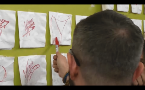
Look at the sheer amount of logos has. According to Chief Creative Officer Connor Barnaby:
When I first saw Richard’s sketches, I went nuts. It represents the human center design that’s at the core of Virgin America. This is a logo that hits you where it hurts, where it feels.


Who likes the new Virgin America logo?
Jason: Me. I’d love to go deep. 😉


